Urblea
Plant Shop
BRANDING
Urblea is an online plant boutique selling young houseplants and cuttings. Urblea is a brand aiming to promote the benefits of caring for houseplants and the rewarding feeling of growing a young plant into its mature form. The client wanted their brand to reflect their love for houseplants and the care placed into each order. Not only is Urblea a place to purchase plants, but a haven to educate oneself about the plants they buy. From Urblea's core values, a brand identity where anyone looking to get into plants will feel welcomed and come out confident was created.
CLIENT
Urblea Plants
TYPE
Branding / Packaging / Commerical / Creative Direction
YEAR
2021

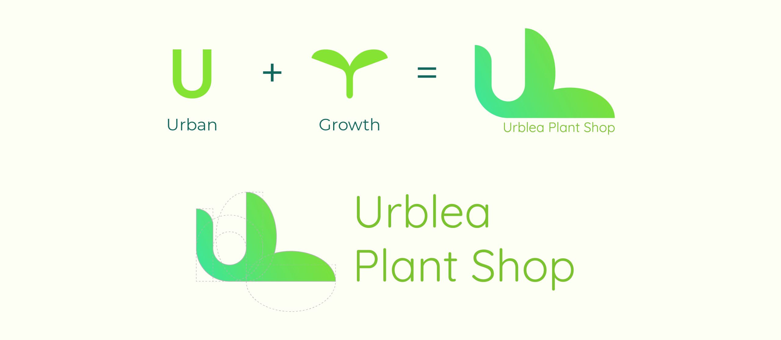
The naming of Urblea comes from the combination of two words: urban and leaves.
Using Urblea's core themes of friendliness and growth, I designed a logo of a budding sprout to represent how one can start from nothing and grow into something beautiful. The brand's color palette provides vigorous energy and blossoming knowledge.

Plant Care Iconography

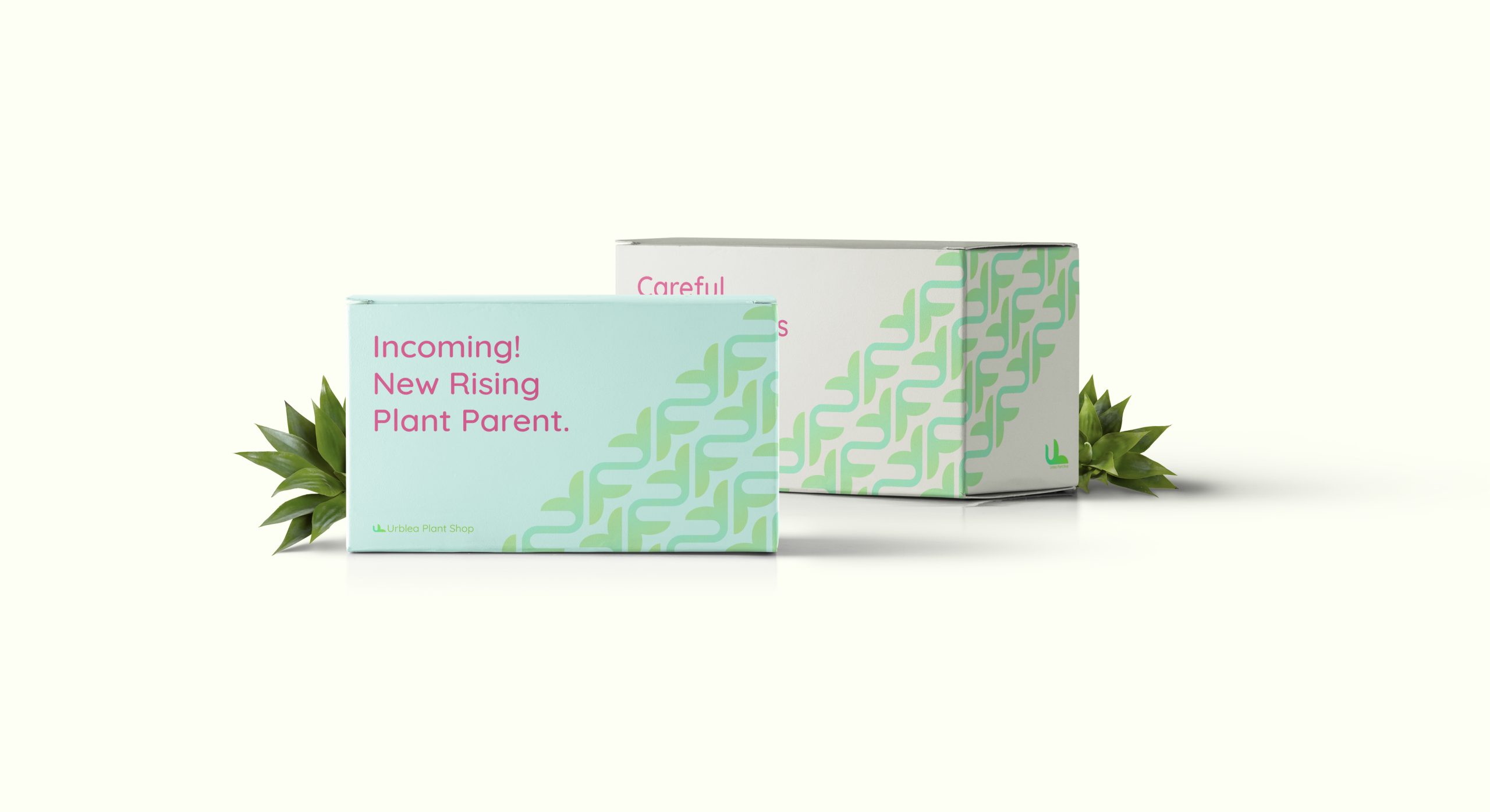
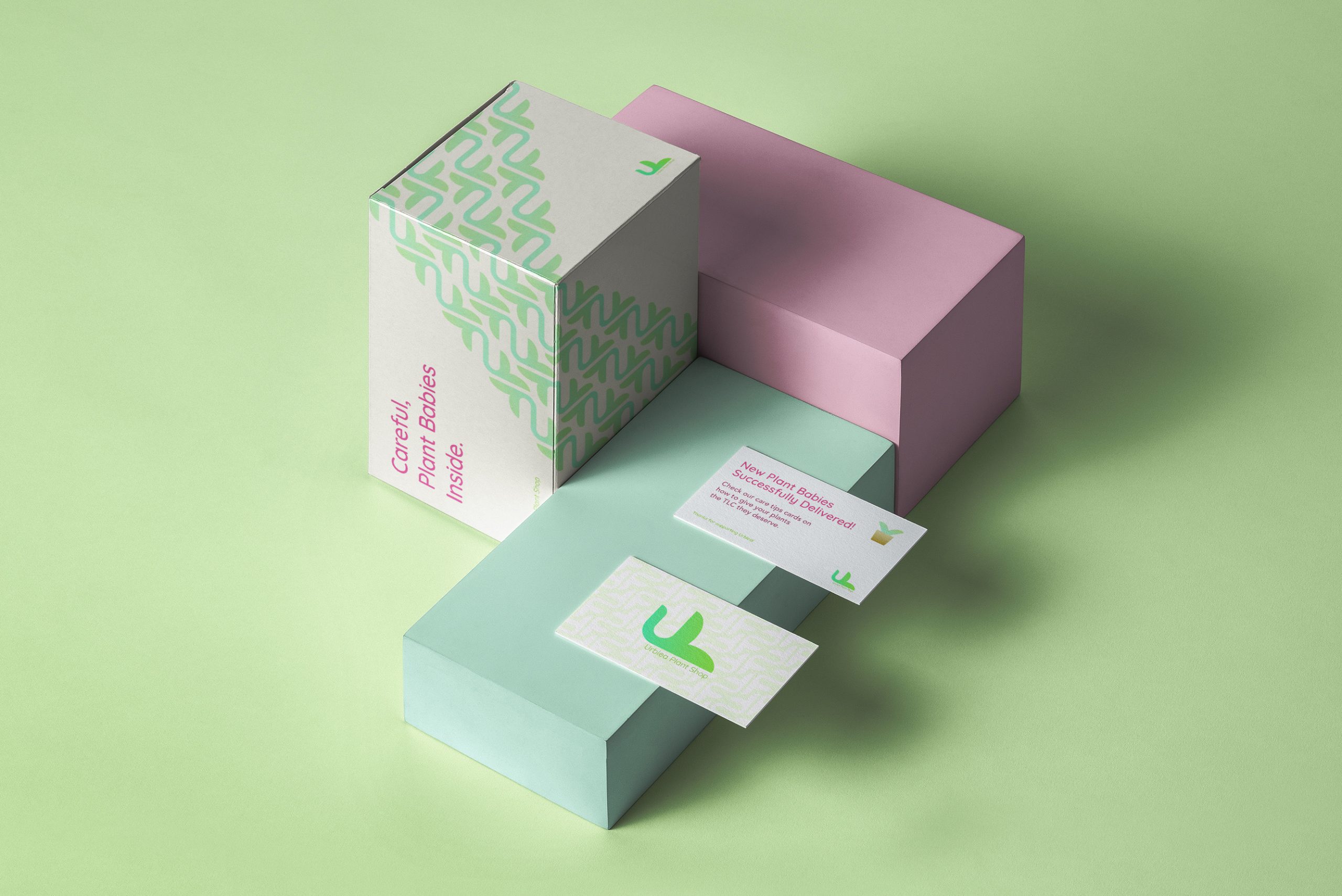
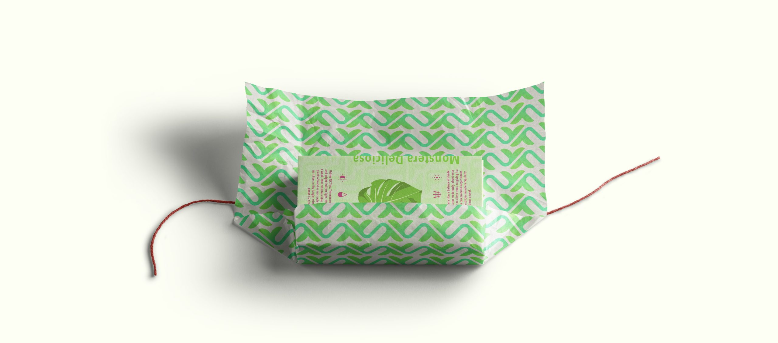
Packaging that brings joy and excitement one would feel when receiving a new houseplant. Through a muted complementary color, the playful copy on the packaging pops out and demands attention. Since Urblea positions itself as selling young plants, each box has a fun and playful message aligning with the joy of being a new plant parent.

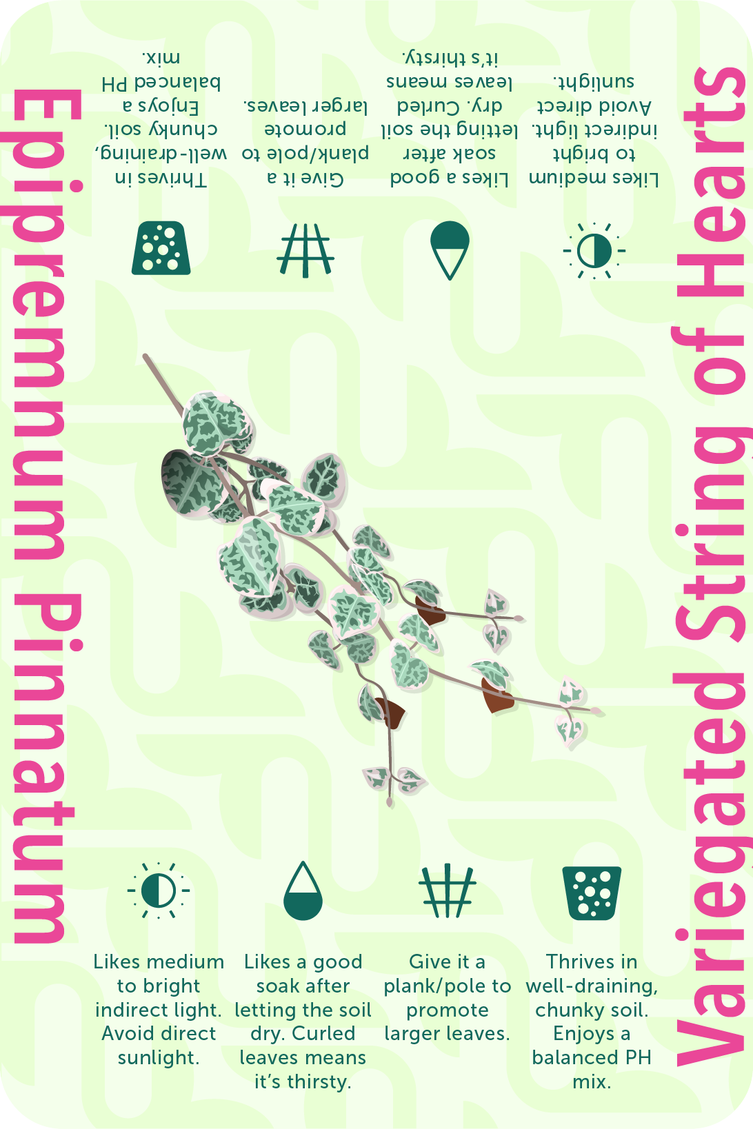
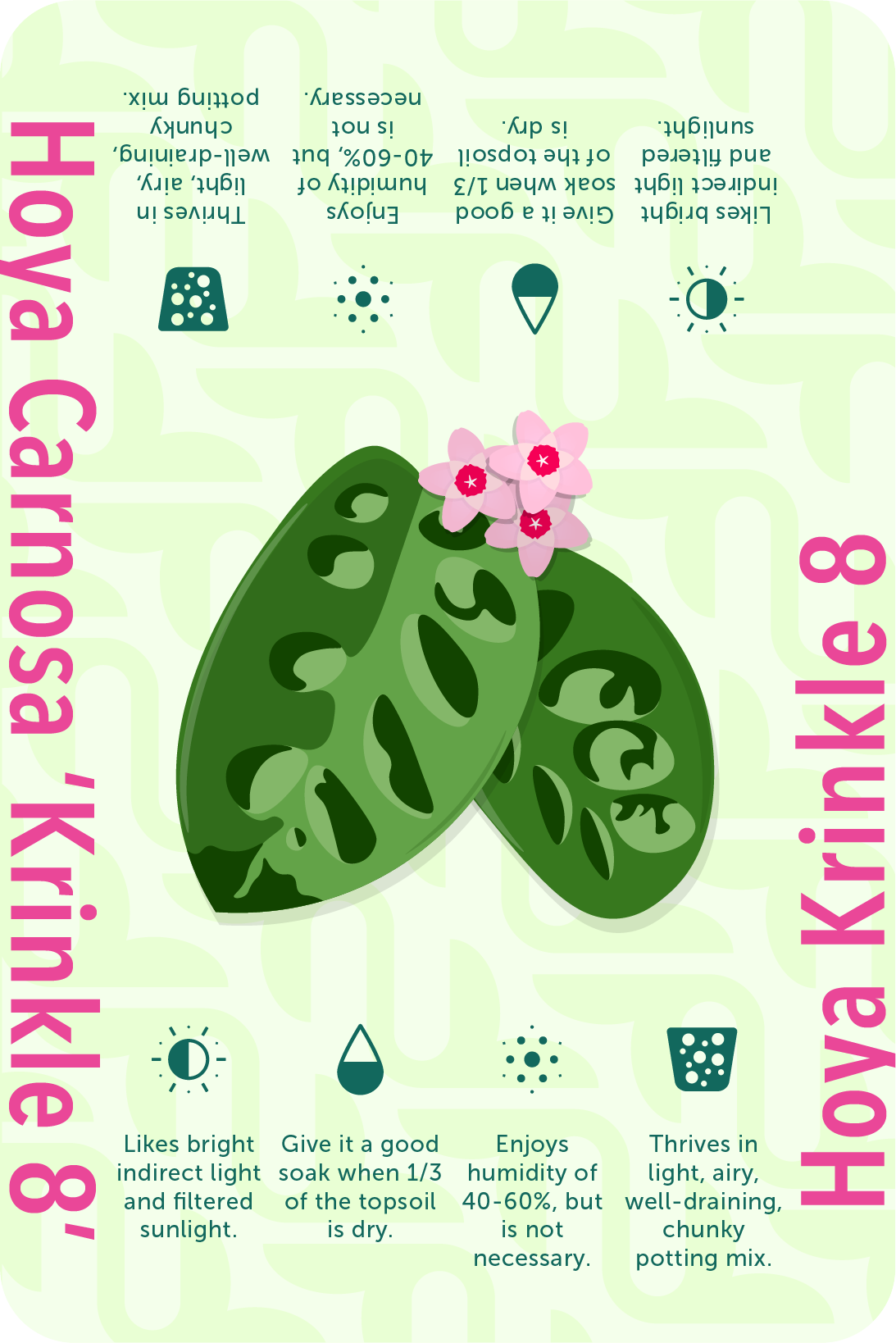
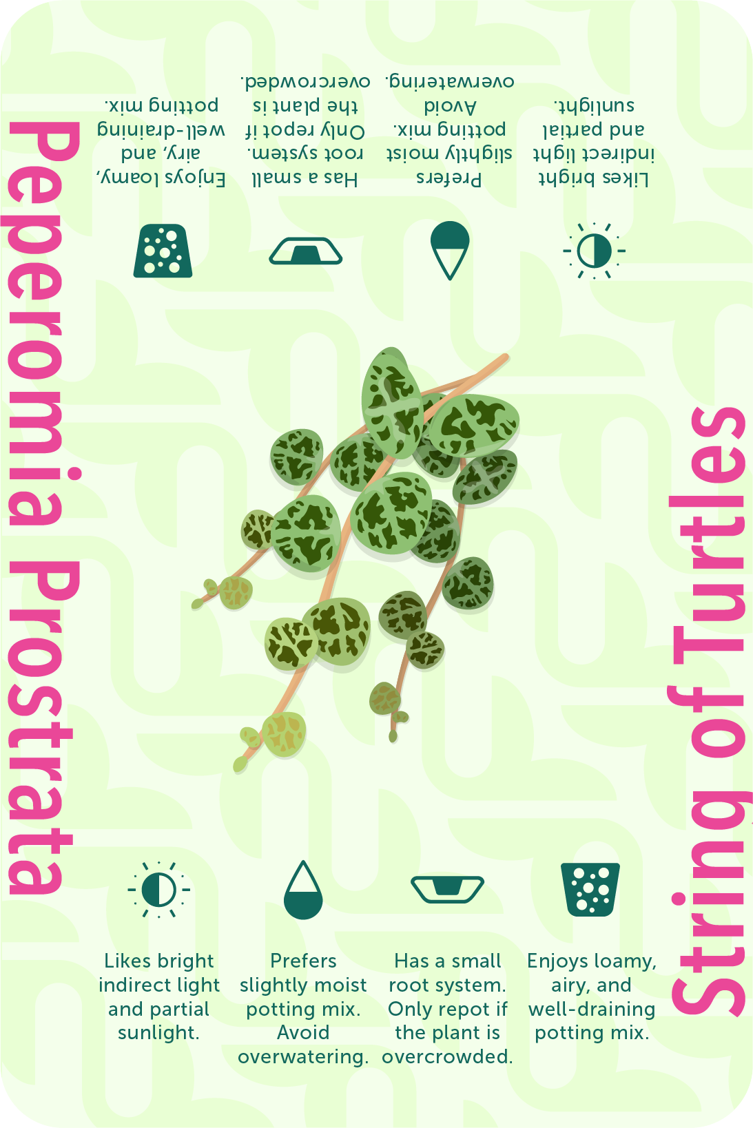
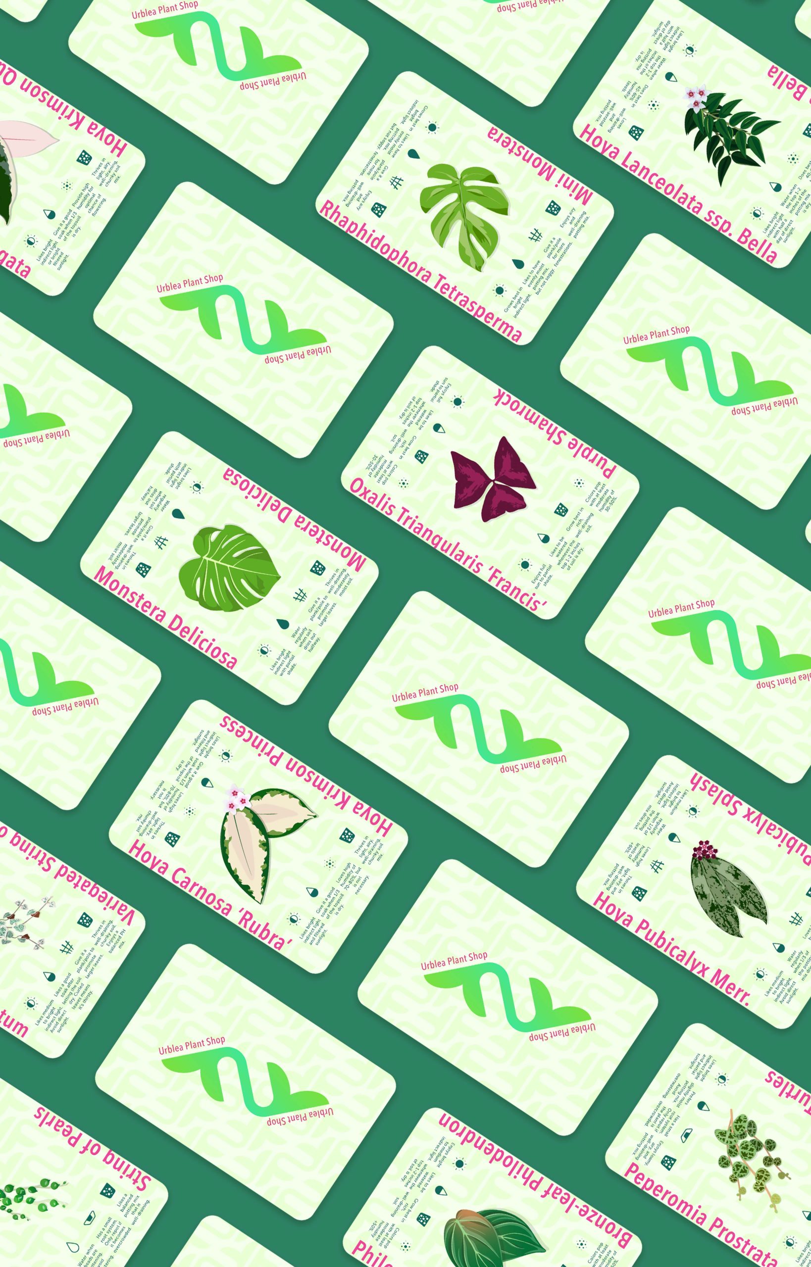
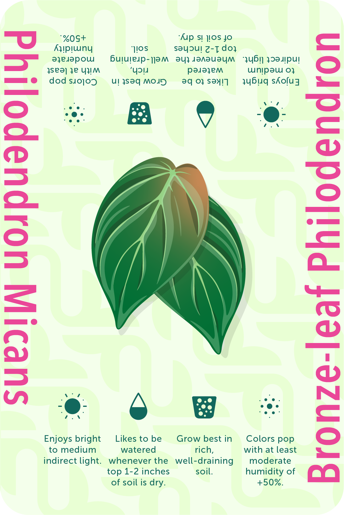
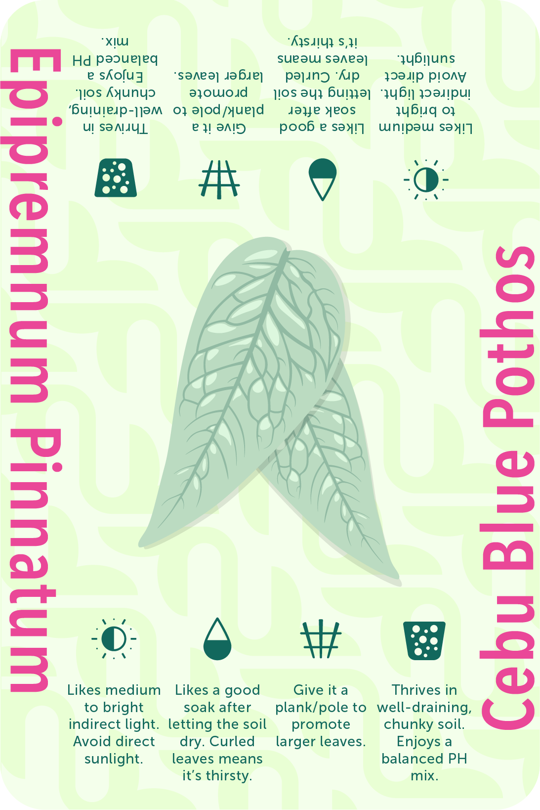
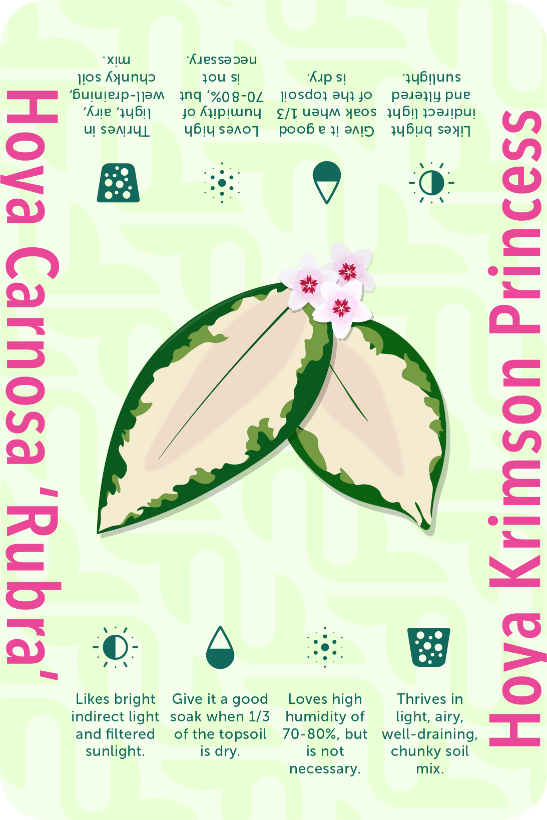
With every order, Urblea places little collectible cards for each plant ordered to help the new plant owner start strong.


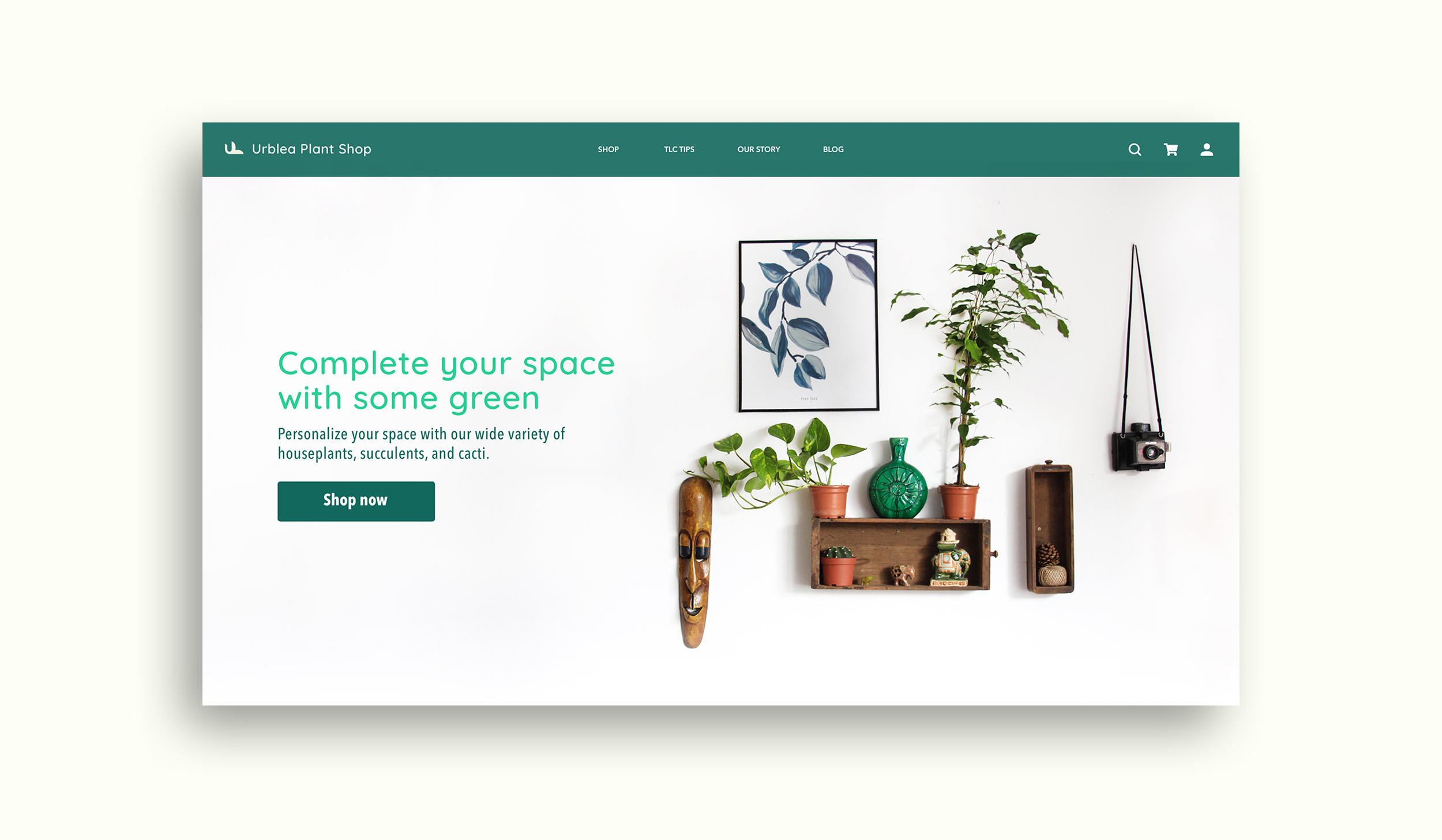
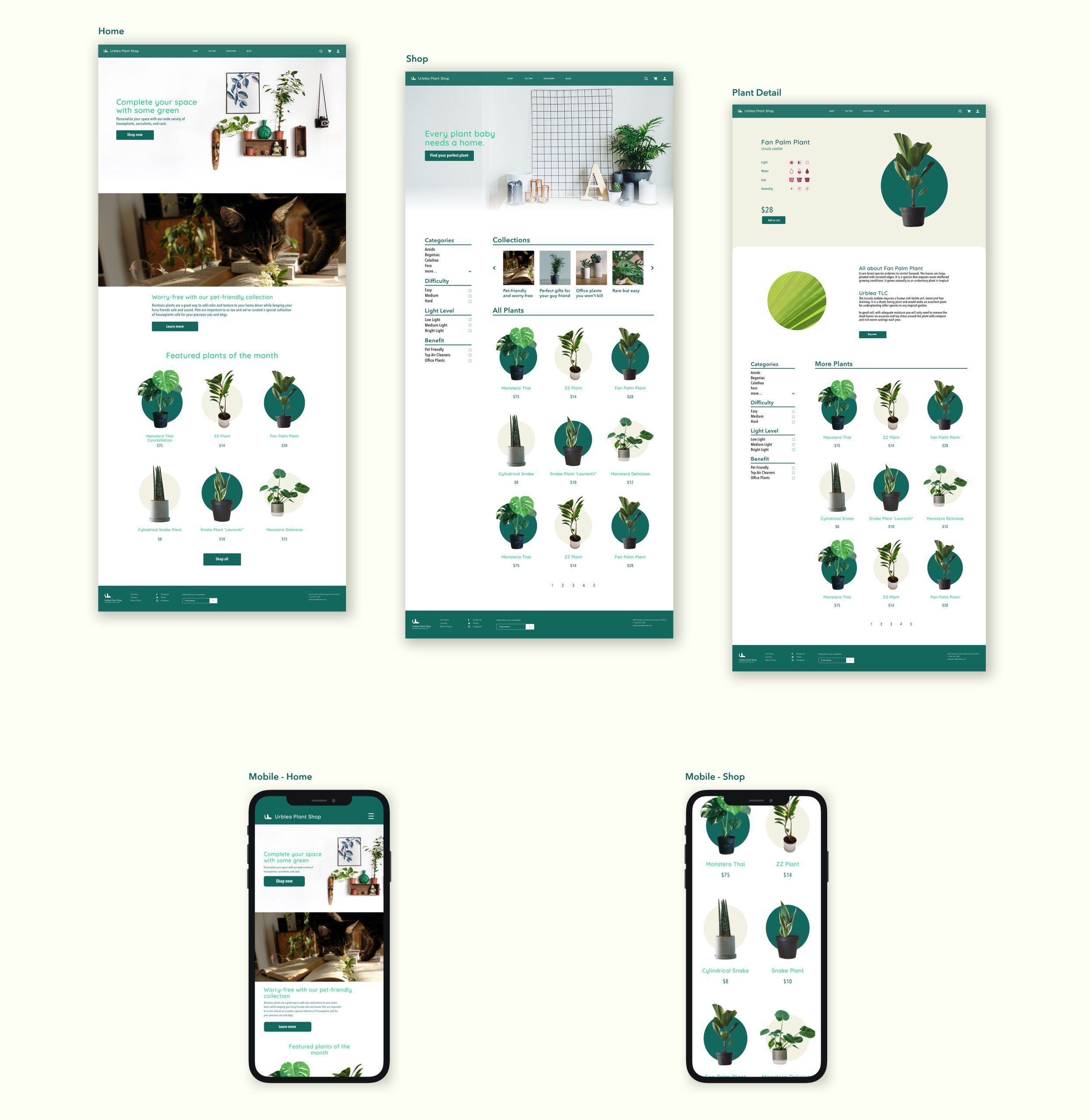
Following the Urblea brand, the website and socials are concise with ease of use in mind. The site incorporates concepts of tranquility, friendliness, and minimalism. The Urblea site aims to be the one-stop shop for houseplants, plant knowledge, and accessories.
