Home
Chilled
BRANDING
Home Chilled Ice Cream Boutique came into fruition as a summertime treat for April’s two sons and the neighboring children. It quickly turned into a passion that ignited what Home Chilled is today. Home Chilled lets you enjoy their concoctions guilt-free as they only use organic ingredients with minimal added sugars. With Home Chilled's upbringing, I wanted to create a logo and identity emphasizing community and unity while staying recognizable as an ice cream boutique. I created a logo with cool frosty notes of color and its' logotype is soft and organic for a sense of community.
CLIENT
Home Chilled
TYPE
Branding / Photography / Packaging / Creative Direction
YEAR
2018

With April's at the core, I designed a logo representative of bringing a community together as one.


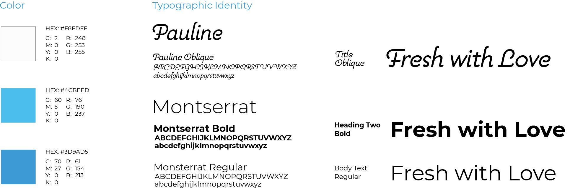
Color & Typographic Identity
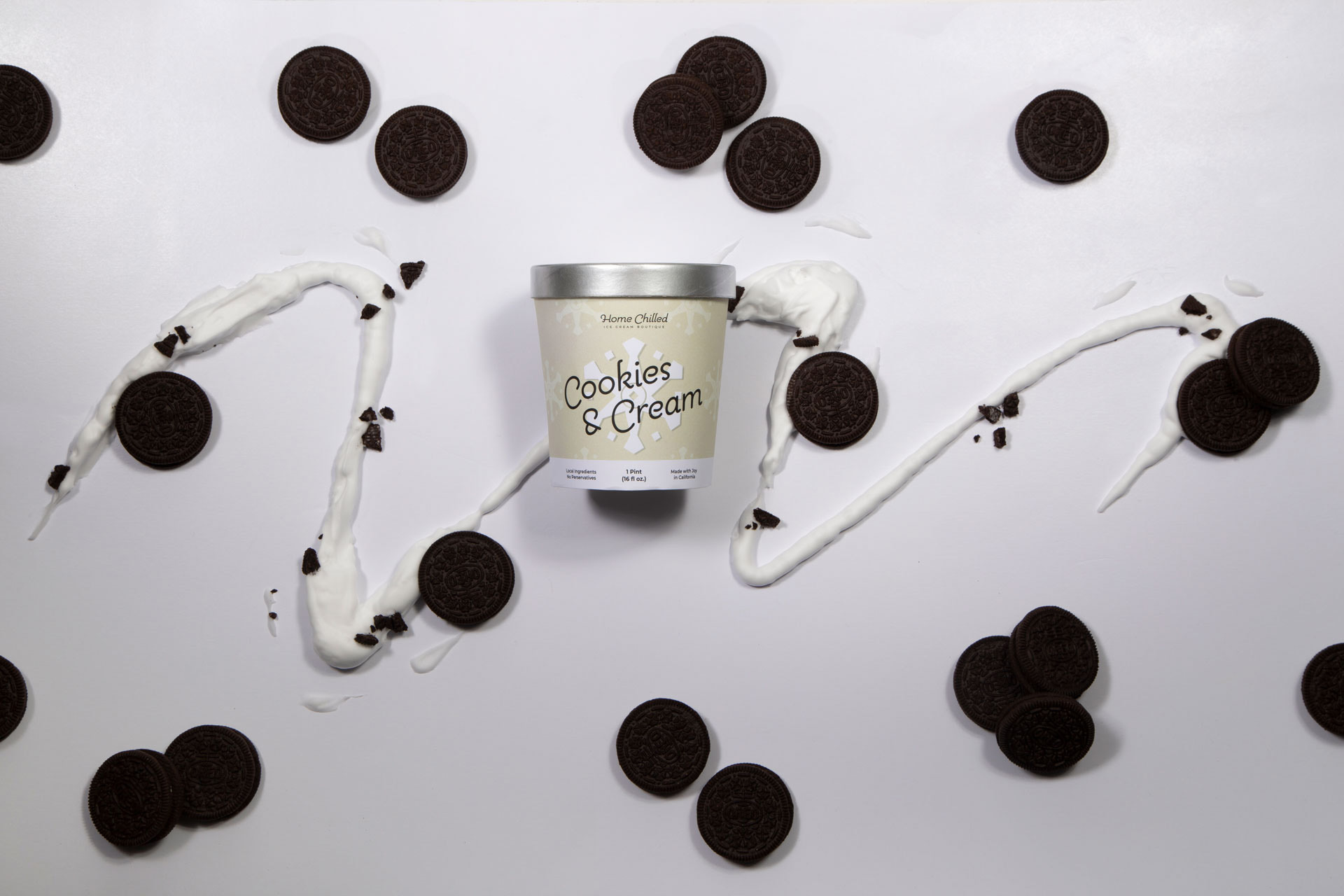
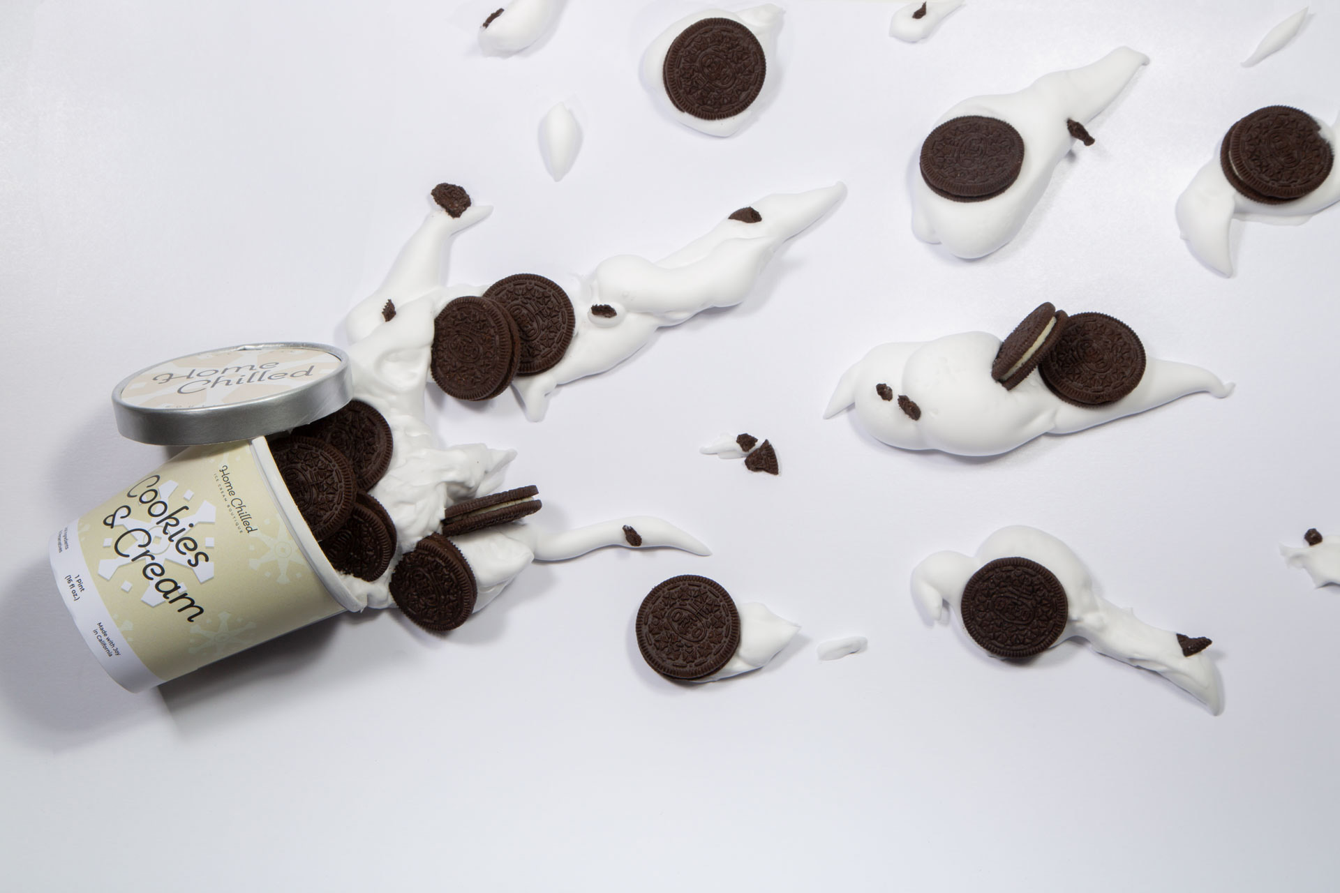
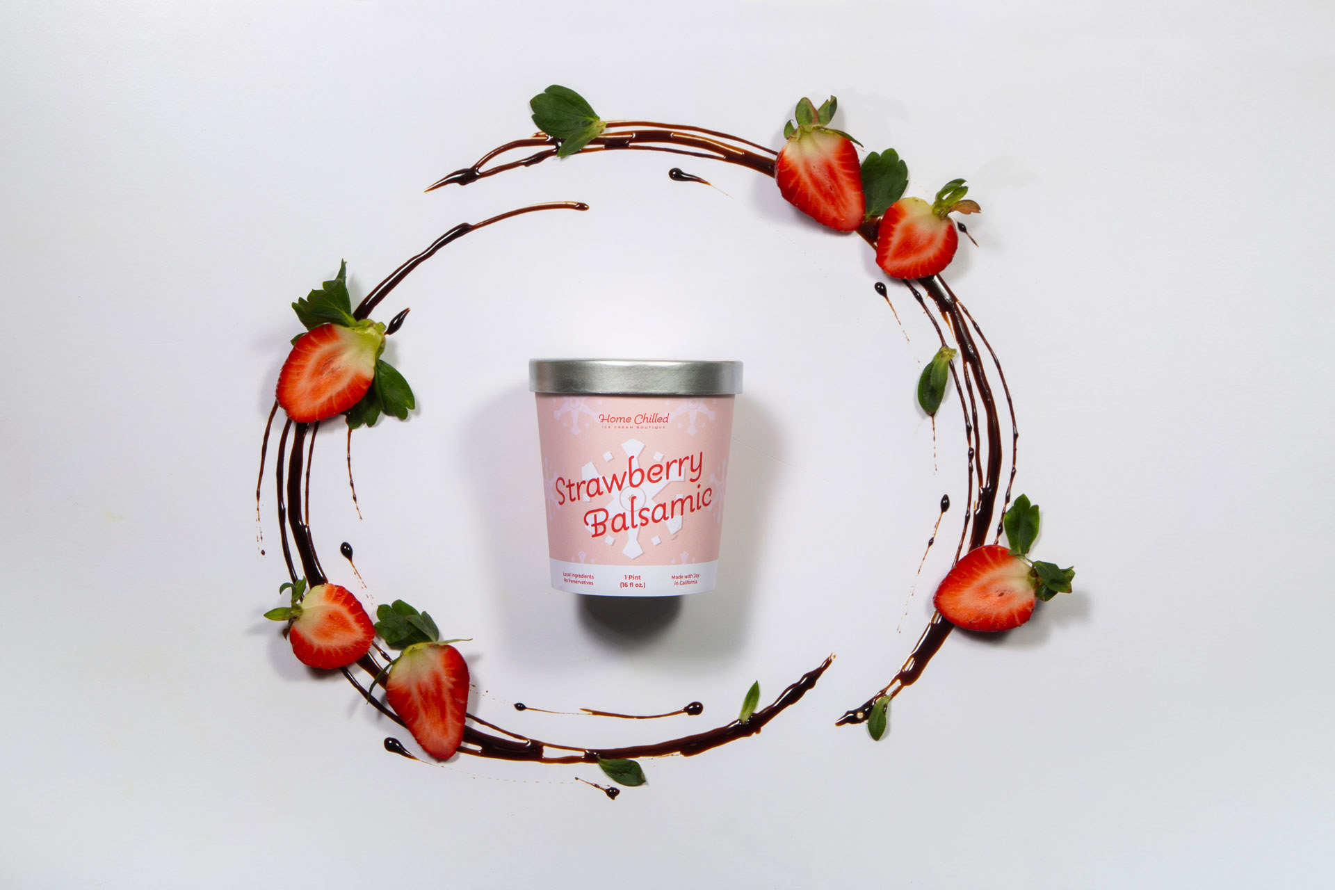
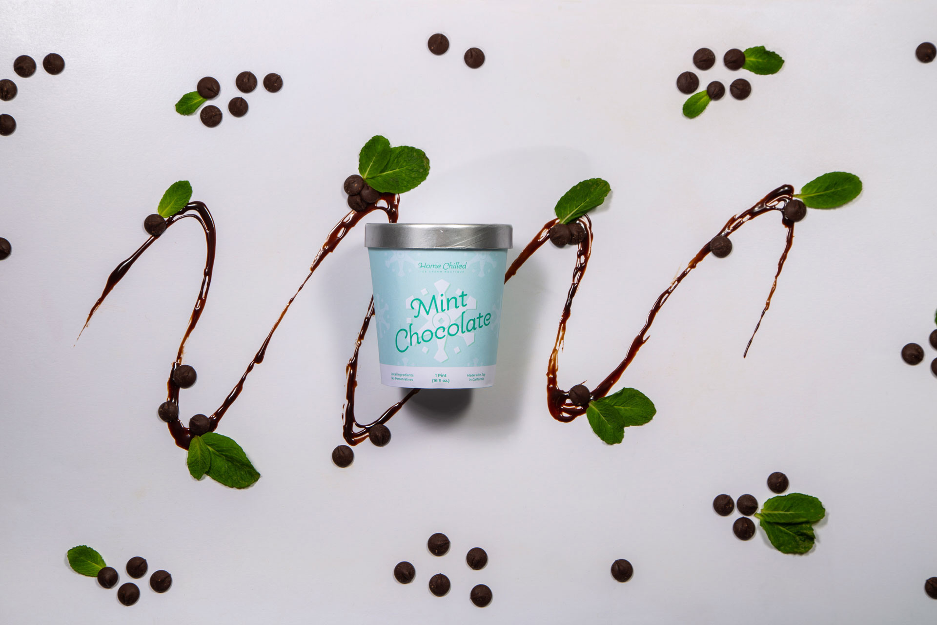
With the foundation of the branding solidified, I worked on Home Chilled's identity in packaging design for the various flavors offered.
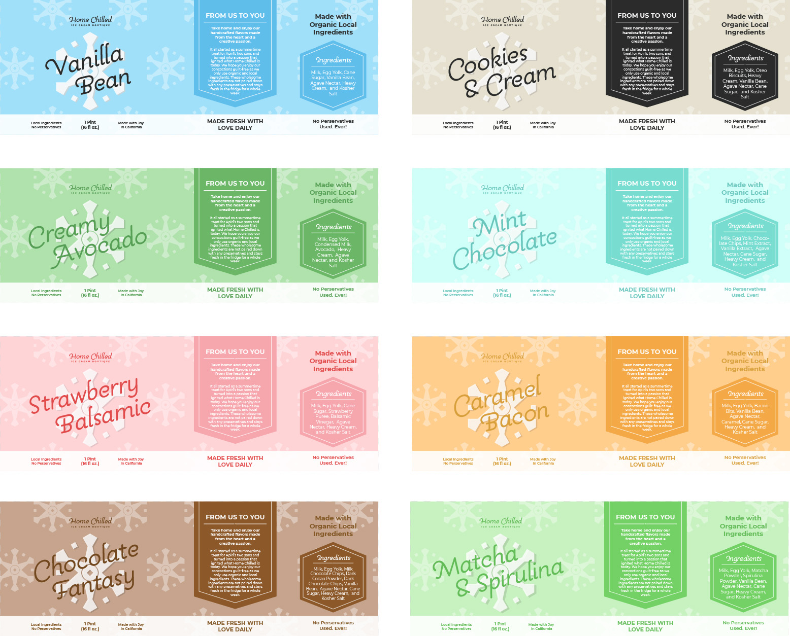
Package Design Warped for Production